Product Design
Repositioning gummy supplements as a premium longevity category
Design system, art direction and shopping experience for a brand that wanted to be taken seriously.
- Client
- CÈFFY
- Role
- Product Designer
- Tools
- Figma, Hotjar, WooCommerce
- Year
- 2026
Built with·WordPress, Elementor, PHP
(01)
About
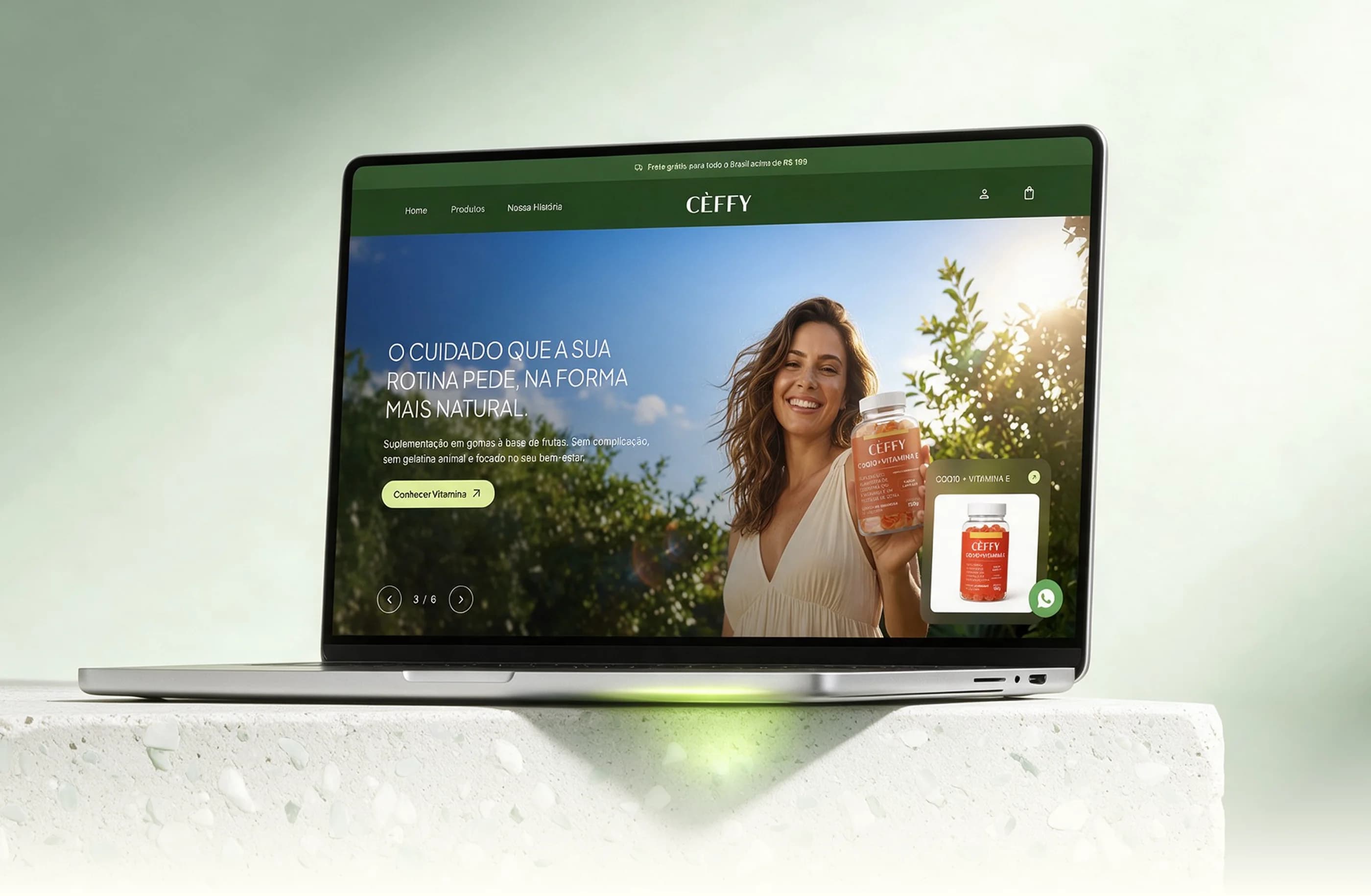
CÈFFY wanted to sell gummy supplements as a premium longevity category, to women who had already been fooled by miracle promises and associate gummies with children's products. My job was to translate that distrust into product decisions. The architecture is organized by goal (energy, sleep, longevity), not by category. The product page puts nutritional transparency and kit choice in the same moment of decision. And the kit and discount logic was designed together with engineering, so the cart never contradicts what the interface promises.
- Discovery
- Information architecture
- Conversion
- Design System
- E-commerce
(02)
Problem
The challenge was two-sided. On one side, convincing a mature audience that gummy supplements are serious, overcoming the format's association with children's products. On the other, enabling flexible kits, progressive discounts and automated tax invoicing, features that native WooCommerce does not support.
(03)
Design Process
We started with discovery and persona mapping to align brand positioning, consumption habits and tax requirements. Based on those insights, we structured the information architecture and reviewed the flows in wireframes using usability heuristics, validating structural decisions with direct stakeholder feedback before the final UI. The Design System, the final UI and the custom PHP engineering ensured visual consistency, calculation accuracy and readiness to scale, from the first click to the issued invoice.
Strategy & UX
- Briefing
- Persona
- Information Architecture
Wireframing
- UX Audit
- Purchase Flows
- Wireframes
Design System & UI
- Moodboard
- UI Kit
- Mobile-First Screens
Development
- WooCommerce
- Integrations
- PHP Customization
(04)
Information Architecture
CÈFFY's architecture was designed around health pillars, not product categories. The flow lets the customer go from Home to checkout guided by goal (Energy, Sleep or Longevity), without unnecessary cognitive load.
- Hero / Carousel
- Product Showcase
- Quick FAQ
- Filters by Benefit
- Sorting
- Product Grid
- Buy Box
- Who it's ideal for
- Nutritional Information
- Reviews
- Product FAQ
- Our Motivation
- Our Solution
- Our Values
- Progress Bar
- Bag Items
- Order Summary
- Your Details
- Delivery
- Payment
(05)
Primary Persona
We developed an in-depth persona to guide every UX decision, from how we communicate benefits to the information hierarchy on product pages.

Cristina Freitas
Marketing Consultant, 42 years old
She has been fooled by unproven "miracle" supplements, and distrusts packaging that seems to appeal to children instead of conveying clinical seriousness.
Keeping energy and drive in her routine without giving up convenience, and feeling that she is investing in something serious for her long-term health.
Total transparency, a clear nutrition table, traceable ingredients and dosage information available even before opening the package.
Feeling that she has finally found a supplement routine that is practical, tasty and aligned with her wellness values.
(06)
Decision Traceability
Every UX decision on the PDP comes from a specific insight about Cristina, not from aesthetic preference. Below, the direct mapping between pain/motivation/expectation/delight and the corresponding design choice.
She has been fooled by "miracle" supplements and distrusts gimmicky packaging.
Design decision
The gummy has a rounded lozenge shape, not a children's fruit-candy look. Product photography follows a serious editorial line, without artificial AI aesthetics.
Keeping energy in her routine without giving up convenience.
Design decision
The kit selector and the progressive discount are concentrated in the Buy Box, solving quantity choice and commercial advantage in a single gesture.
Total transparency, with traceable ingredients and accessible dosage.
Design decision
The nutrition table appears in the very first carousel image and gets its own section on the PDP, next to highlights of the product's main benefits.
Finding a routine that is practical, tasty and aligned with her values.
Design decision
Product photography and flavors prioritize a sensory, authentic aesthetic, with real Brazilian women, not a sterile pharmacy look.
(07)
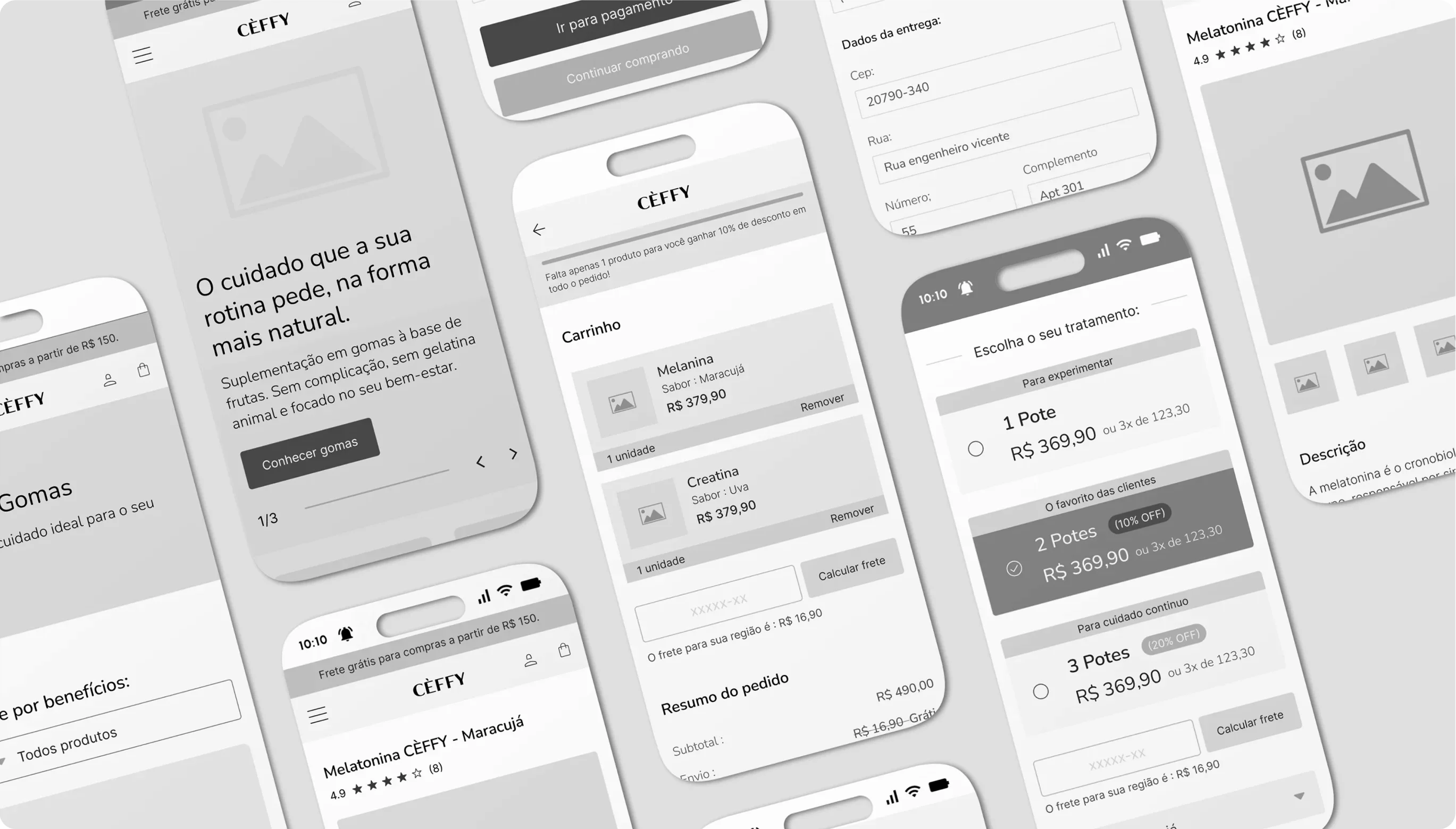
Wireframes
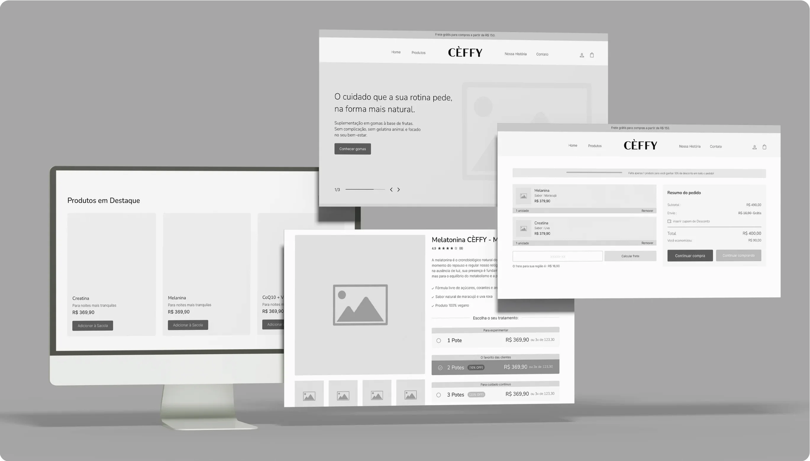
Before the aesthetic layer, we tested the structure in low and mid-fidelity wireframes in Figma, validating where the Buy Box, the kit selector and the nutrition tables should sit to capture attention at the right moment of the journey.
(08)
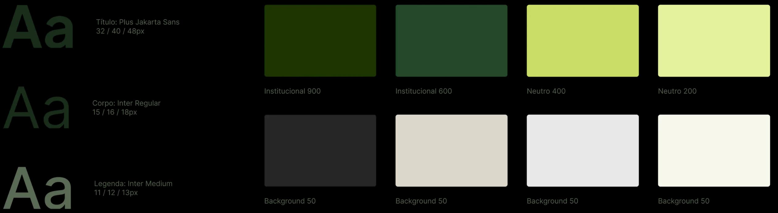
Style Guide
Designed mobile-first, since most of the traffic comes from phones: comfortable touch targets, an institutional green that communicates health without looking childish, and typography built for dosage legibility on small screens.
(09)
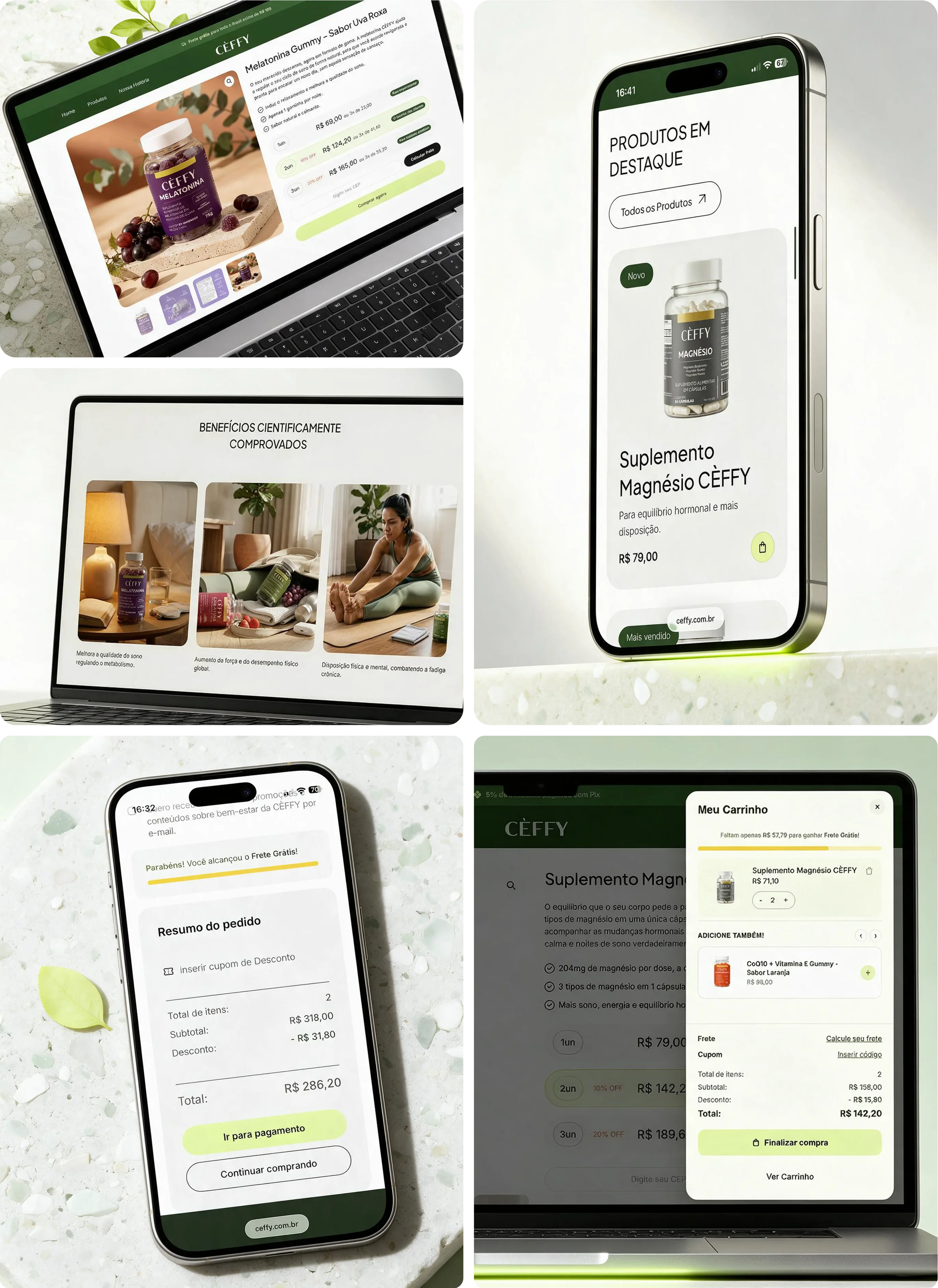
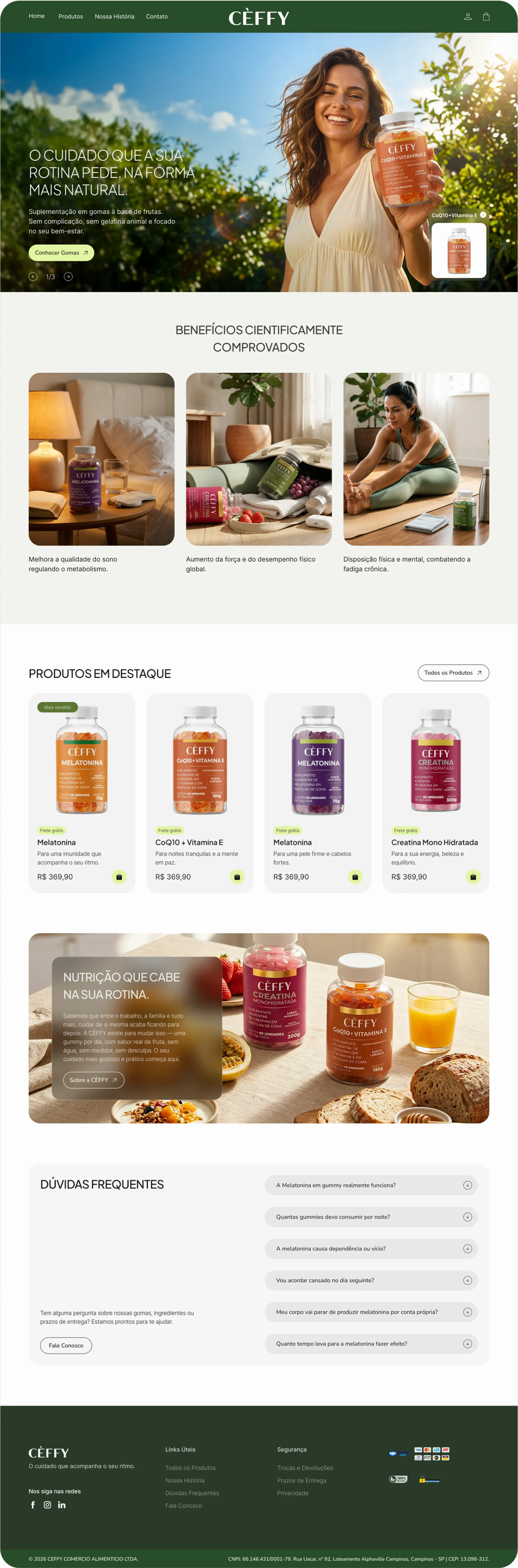
UI Design
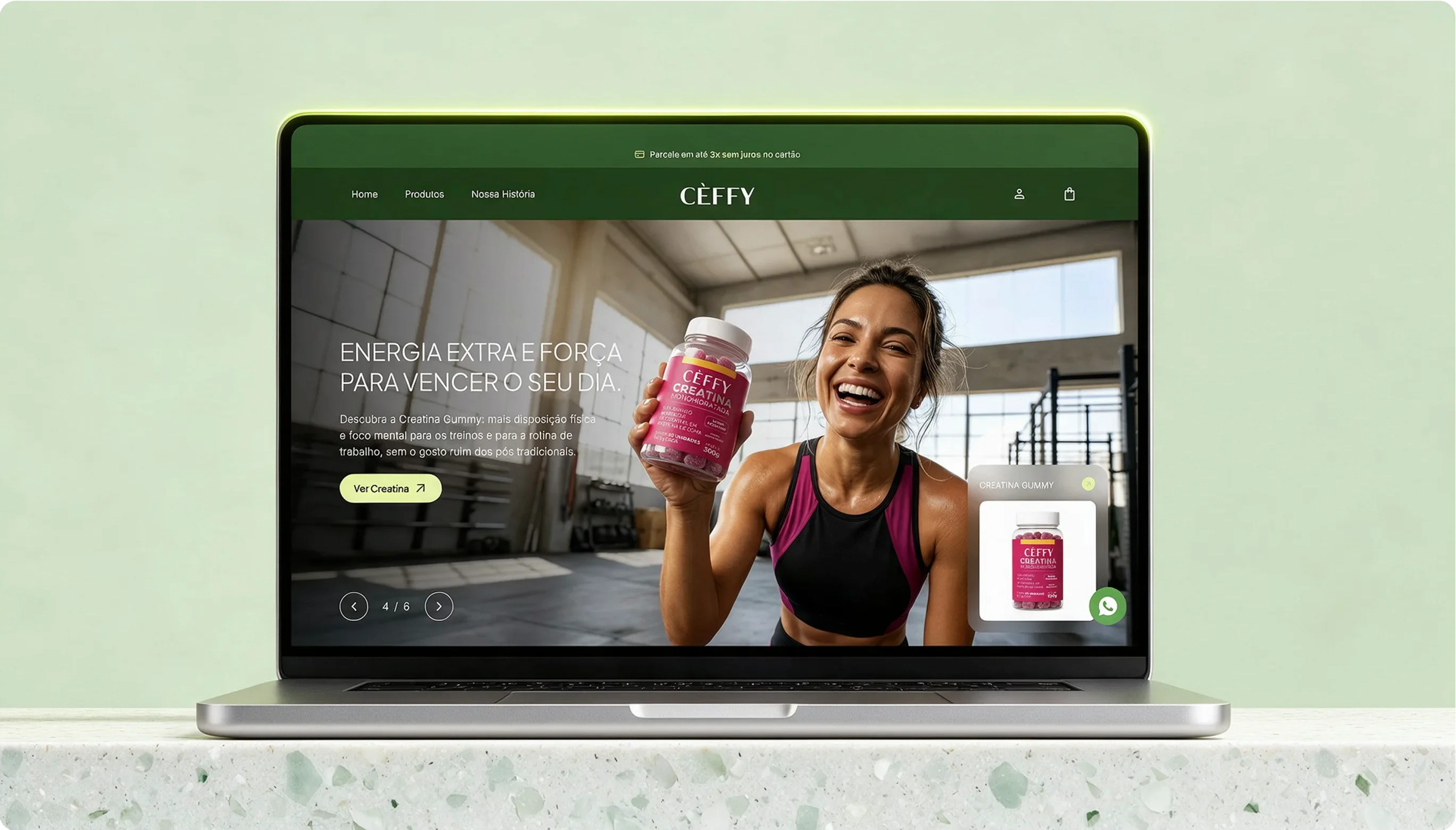
From the Home to the order confirmation, every screen guides the user smoothly. On the PDP, the Buy Box concentrates the progressive discount and the kit selector in a single decision gesture.
(10)
The constraint that shaped the design
The Buy Box promises kit and progressive discount in a single gesture. In native WooCommerce, those are two discount rules competing for the same cart, and without resolving that conflict the interface would show a price the cart doesn't deliver. So the cart rules were designed as part of the experience, together with engineering, and became a chain of custom PHP hooks.
- 01
Conditional fee
The kit discount is only applied when the number of pieces in the cart matches exactly what is expected; an incomplete kit never generates an undue discount.
- 02
Conflict exemption
Before the fee is calculated, kit items are forced back to full price so they do not collide with the quantity-based progressive discount.
- 03
Consolidated shipping
The loose kit components are unified into a virtual package only for shipping calculation, using the parent product's weight and dimensions.
- 04
Reverse unbundling
If the customer removes a component, the surviving siblings become normal products, eligible for the Tier discount.
- 05
Quantity split
Taking 2 units of a kit item locks the line at 1 and sends the surplus as a standalone product, with its own progressive discount.
View code excerpt
// K8. Fee só aplica com o kit completo no carrinho
if ( $i['discount'] > 0 && $i['expected'] > 0 && $i['live'] >= $i['expected'] ) {
    $cart->add_fee( 'Desconto Kit: ' . $i['label'], -$i['discount'] );
}(11)
First behavior signals
The store runs Hotjar. Before looking at the data, I defined which signals confirm or refute each PDP decision. The findings, and what changes because of them, will be added here once there are enough sessions to draw conclusions.
Clicks on the kit selector and the buy button, relative to PDP sessions.
Decision under test
Concentrating kit and progressive discount in the Buy Box solves the choice in a single gesture.
Scroll to the nutrition section before clicking buy.
Decision under test
Transparency is checked before purchase, as the persona suggested.
Abandonment after a kit or discount is applied.
Decision under test
The cart holds the price the Buy Box promised, with no surprises at checkout.
(12)
Technical performance
PageSpeed audit on the live site, before delivery. It is evidence of technical quality, not of business impact.
- Performance
- Desktop 92 · Mobile 90
- Accessibility
- Desktop 95 · Mobile 95
- Best Practices
- Desktop 100 · Mobile 100
- SEO
- Desktop 92 · Mobile 92
(13)
Final Reflection
If this project had a second phase, the biggest gain would not be in the UI, but in closing the loop between design decisions and real behavior. Flow validation so far was a heuristic review done by us, complemented by structured stakeholder feedback on the wireframes, which is enough to reduce technical risk but does not replace moderated testing with the real persona before the final UI. The next step is to read the signals above with enough volume and come back to this case with real behavior and conversion data, not just technical performance.
Next case
Instant credibility for a solar brand no one in Brazil knew